Create a plot which is fully customisable by the user.
Arguments
- df
The data to plot.
- plotting_method
The type of plot to create (either "line", "scatter" or "histogram")
- ...
A set of arguments mapping certain variables to aesthetics. Each argument should be specified in the format
aesthetic = "column_name", whereaestheticis a visual property that a variable can be mapped to (e.g. x, colour), andcolumn_nameis the name of a column in your data.- .interactive
Whether the plot is going to be transformed into an interactive graph using
plotly::ggplotly(). IfTRUE, and thealphaaesthetic is used, the alpha variable will be transformed usingfactor(), sinceplotly::ggplotly()errors when it encounters a continuous alpha.
Value
A ggplot2::ggplot() object.
Line graphs
Create line graphs passing in "line" to the plotting_method argument.
Line graphs accept the following aesthetics:
x- the variable on the x axis.y- the variable on the y axis.colour- the colour of the line.
x and y are required arguments, meaning that they must be supplied for a
plot to be outputted.
Scatter graphs
Create scatter graphs passing in "scatter" to the plotting_method argument.
Scatter graphs accept the following aesthetics:
x- the variable on the x axis.y- the variable on the y axis.colour- the colour of the point.size- the size of the point.shape- the shape of the point.
x and y are required arguments, meaning that they must be supplied for a
plot to be outputted.
Histograms
Create histograms passing in "histogram" to the plotting_method argument.
Histograms accept the following aesthetics:
x- the variable on the x axis.colour- the colour of the bar.size- the size of the bar.
x is a required arguments, meaning that it must be supplied for a plot to
be outputted.
The y aesthetic of a histogram is the frequency density of the x coordinate.
Examples
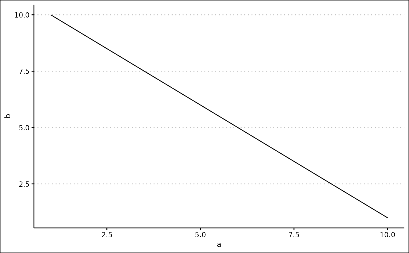
data <- tibble::tibble(
  a = 1:10,
  b = 10:1
)

custom_plot(data, "line", x = "a", y = "b")